
Yesterday I thought that my blues were going to head off toward purple territory, but color moods can really shift from day to day and I think it’s a good time for a bit of aqua.
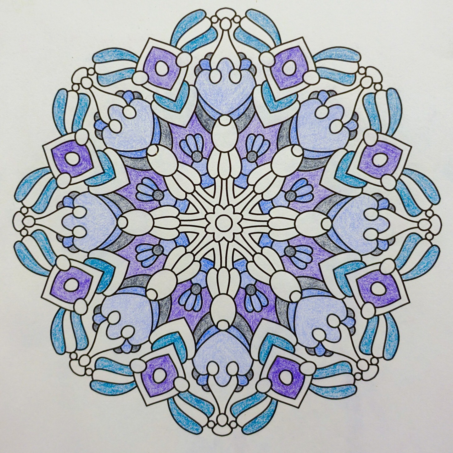
It’s kind of amazing how much the overall color appearance of a picture can change when you add a dab or two of a new shade.
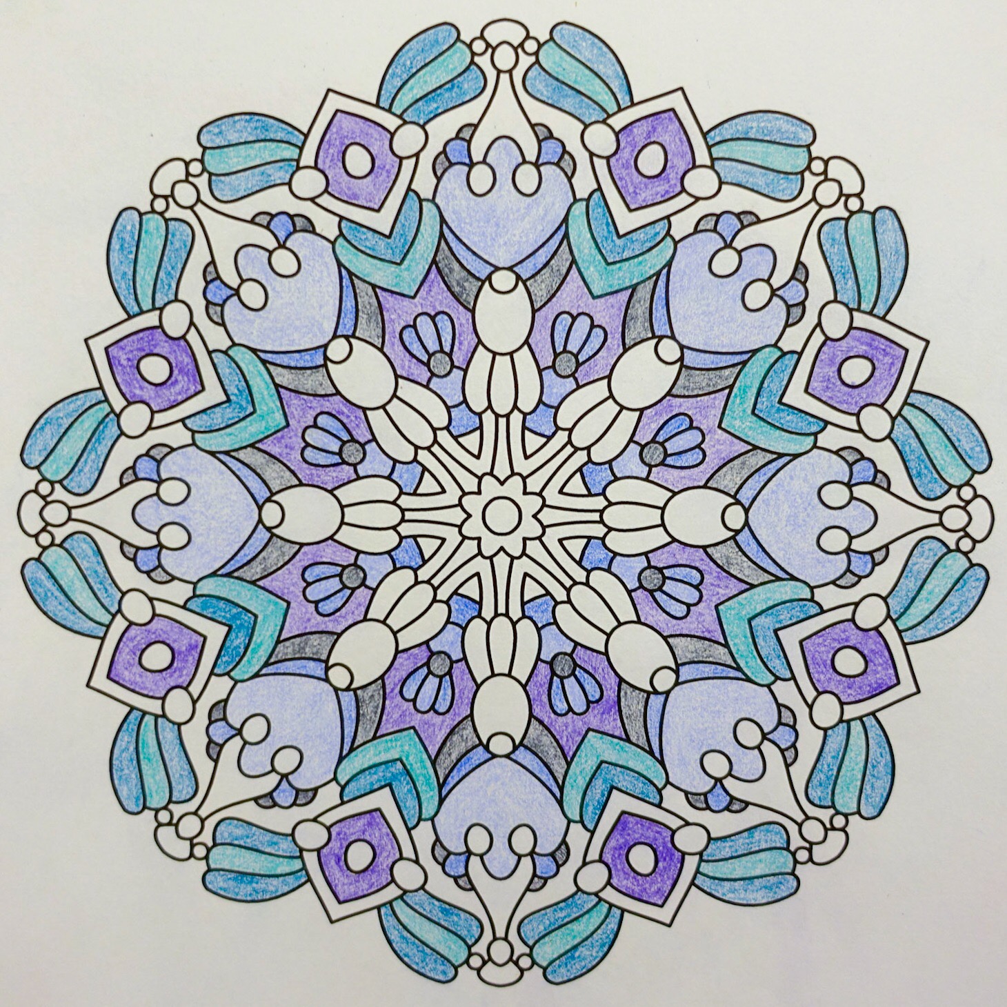
I barely notice the original shades of blue right now. The two aqua tones and the purple are the ones that are really grabbing my eyes right now.
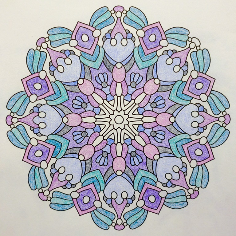
This next addition of warmish pinkish purples totally change the overall look of the picture again. I keep paging back and forth between my photo with the pinky purple and the previous one with the two aquas. It’s hard to describe exactly what’s changing, but the first one seems quite calm and the second much energetic.
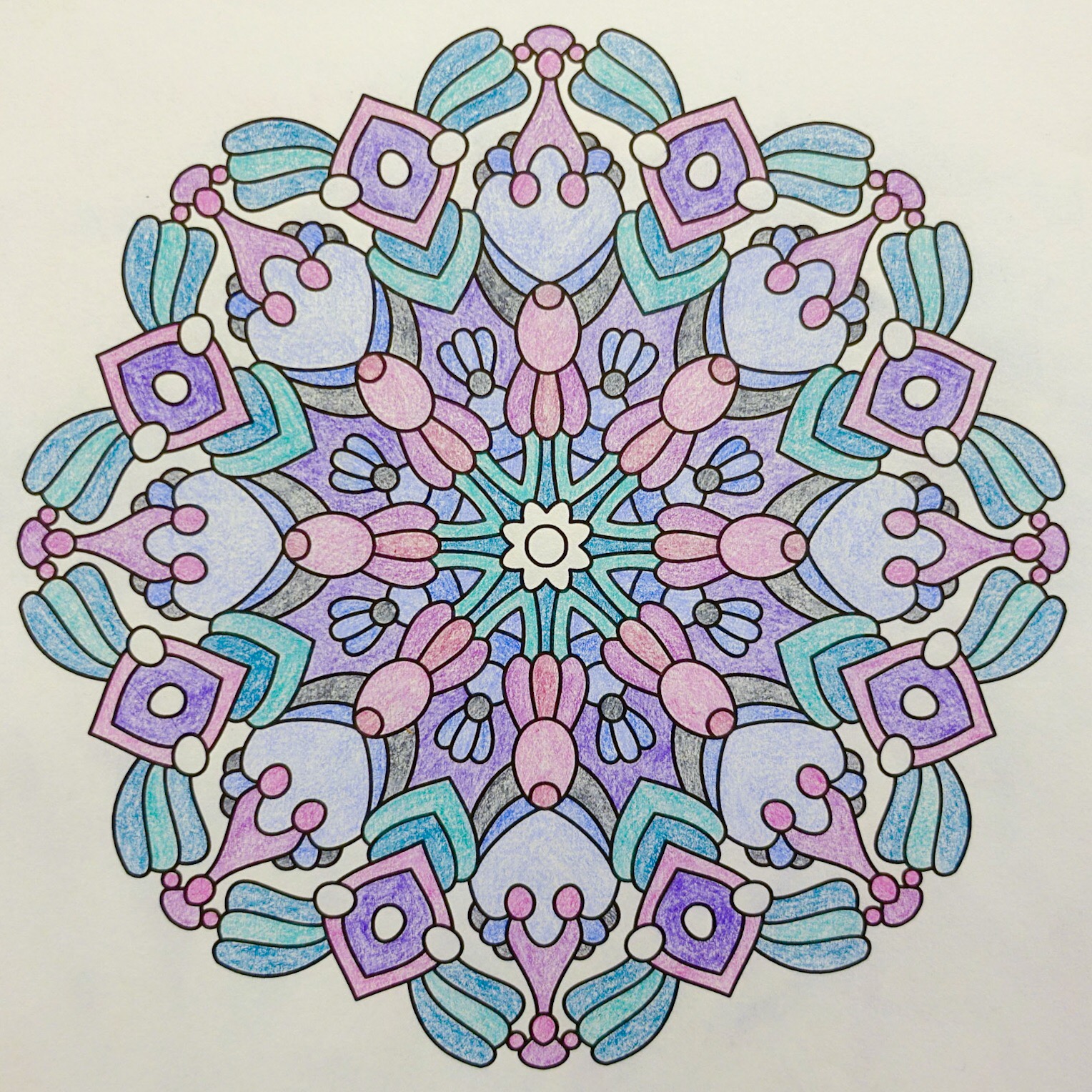
Now I’m finishing off the picture without adding any new shades to the mix. Repeating the aqua from the outer edge as the main color in the middle piece helps to connect everything together nicely.
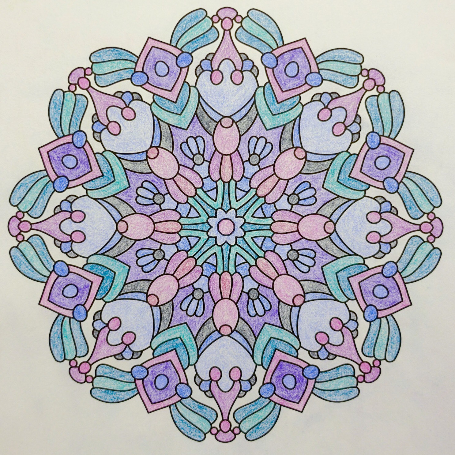
And here’s the finished coloring. There are quite a few different shades in there, but less than half a color wheel’s range in hue. I often find my pencil colorings like to use color schemes that are basically a small section of a rainbow. I think a lot of that is because I enjoy coloring with a fairly steady pressure so that I don’t have huge differences in light and dark in my pencil pictures. With all of my colors being kind of medium in terms of lightness and darkness, gentle variation in hue keeps everything looking very soft and cozy.
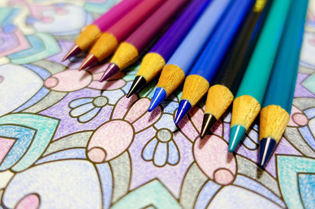
Today’s coloring is from Balance For Crayons And Wide Tipped Markers, colored with these Faber-Castell colored pencils.