
Sometimes it’s nice to relax with a very easy coloring session. Coloring the background of a drawing using a gentle progression of related colors can start you out with a nice strong foundation – and that can help your colors play nicely together when you reach the later stages of coloring.
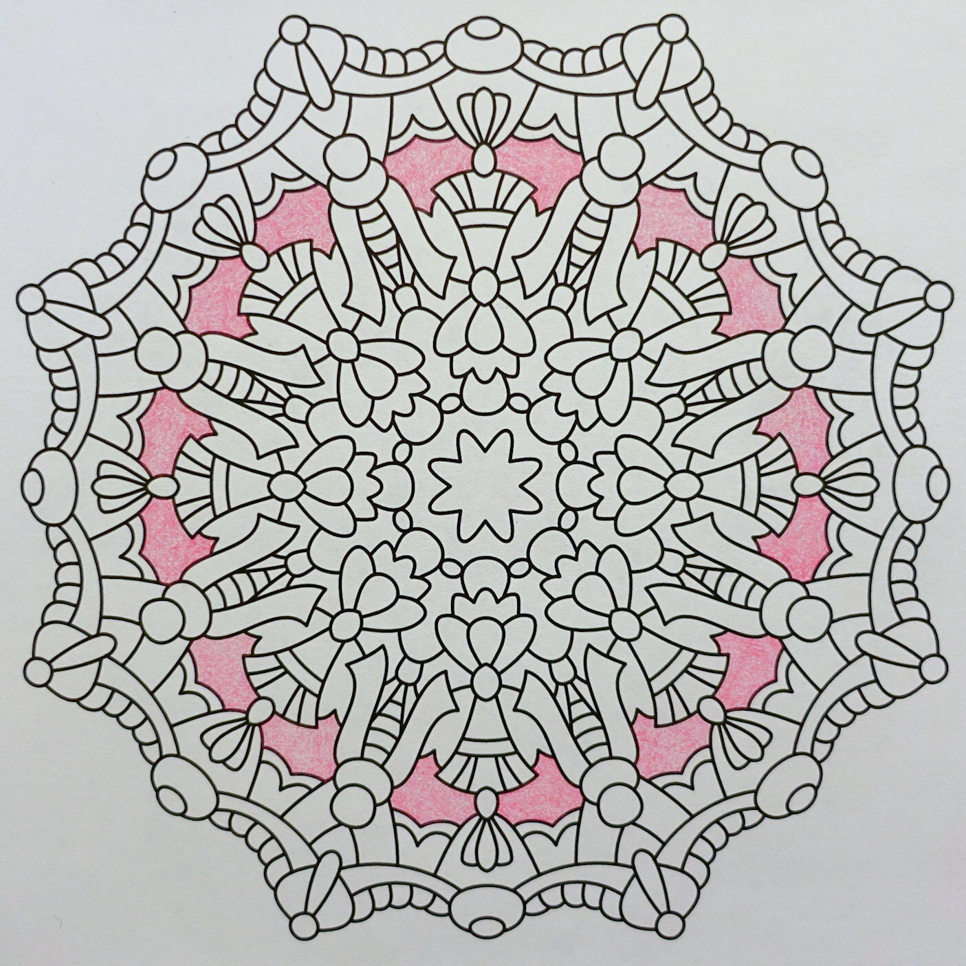
I started out with one of the larger background shapes and kind of a medium pink shade.
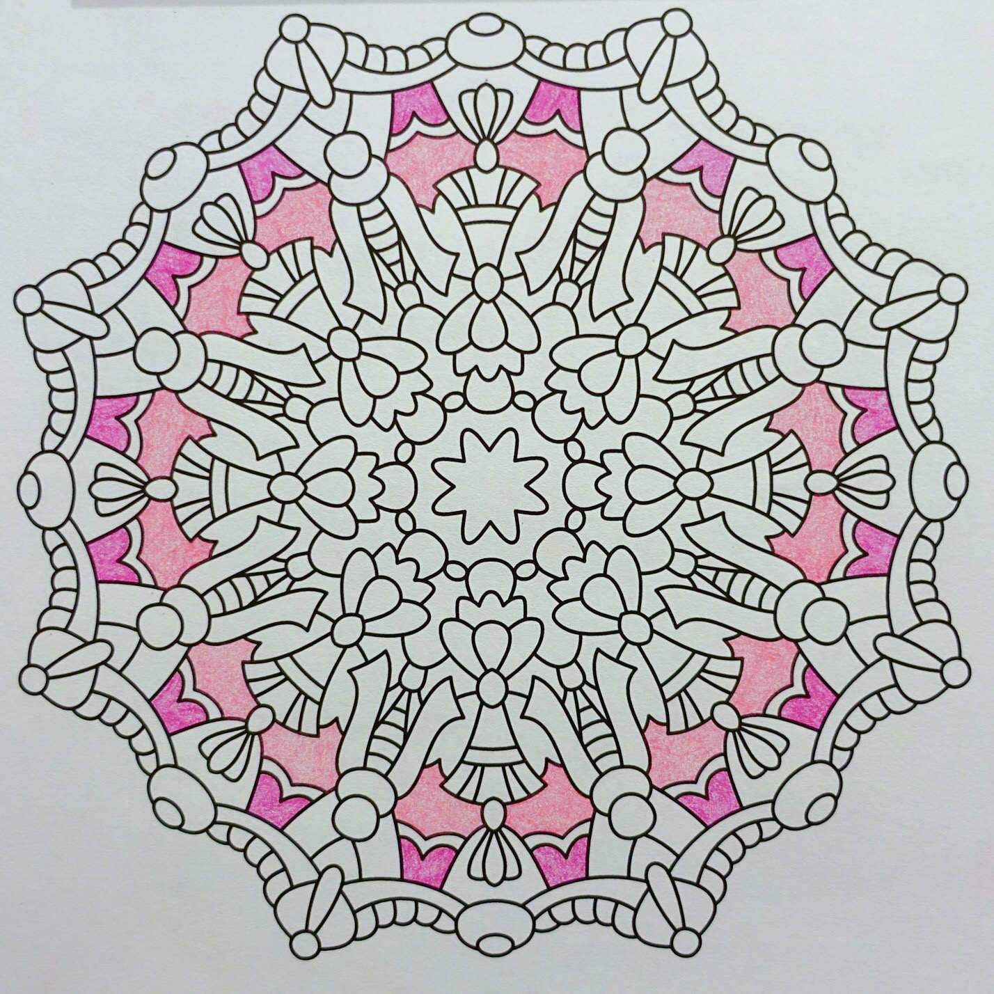
Then a dab of darker pink towards the outside.
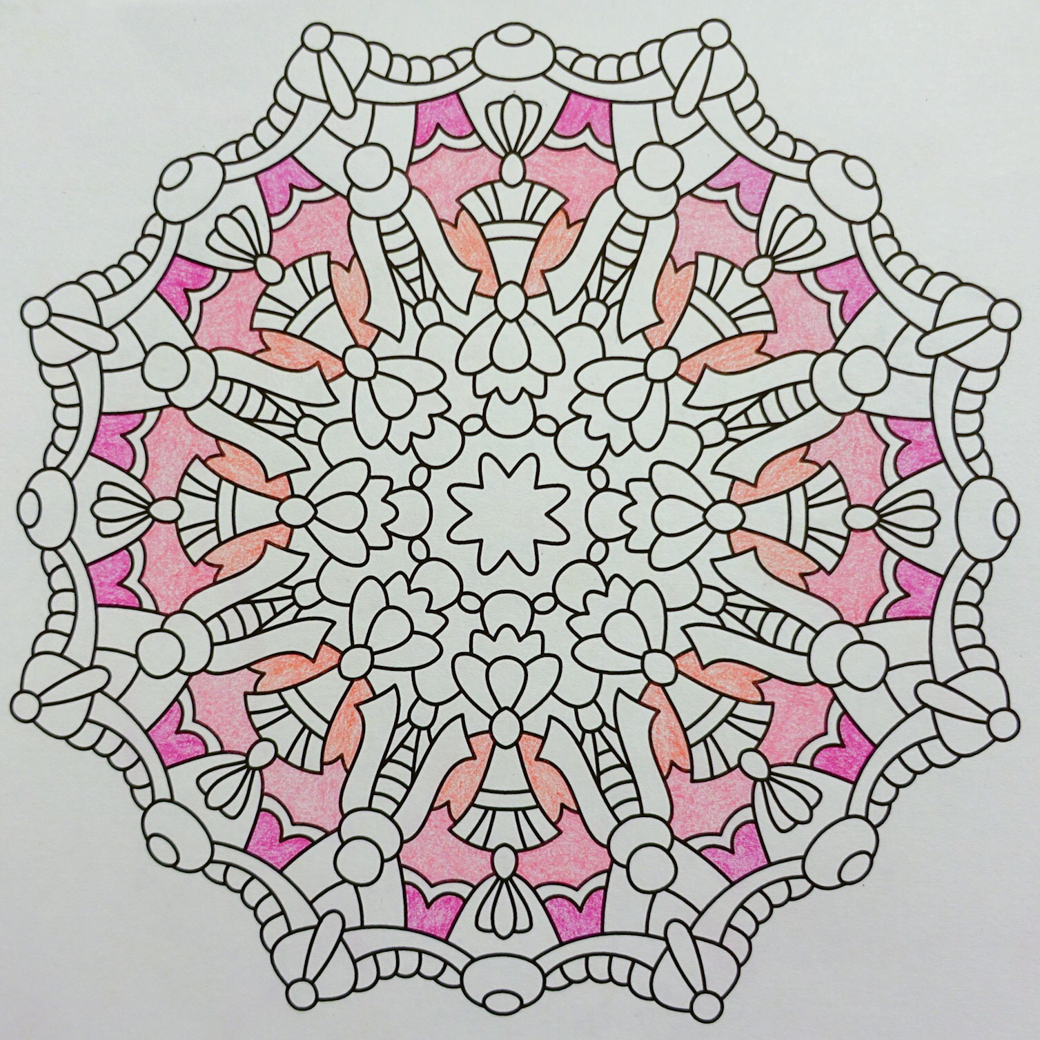
And then a pinky coral. I wanted a shade a bit lighter and pinker than this, but this should be fine.
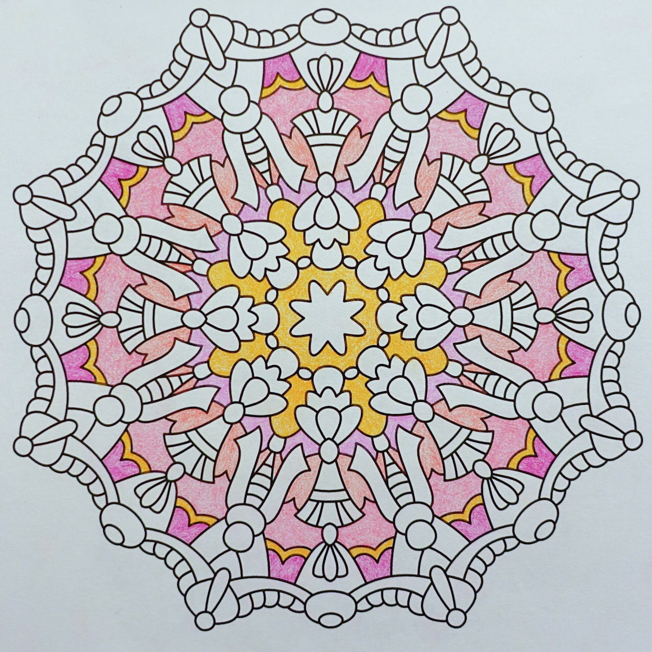
Then a couple of shades from a little further away on the color wheel, but they aren’t a shocking contrast with the pink tones.
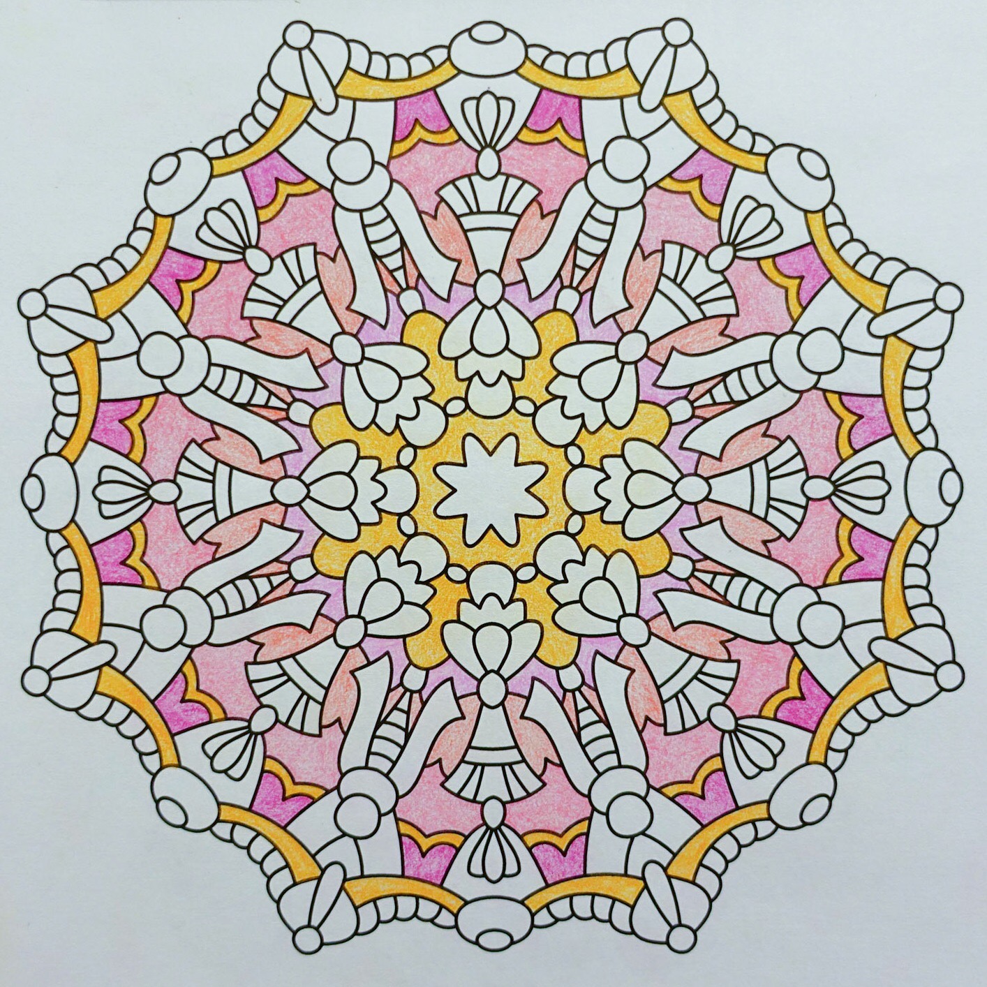
And finally, tying the color scheme together by repeating the orange from the center as edging along the outside of the design.
There’s still a lot of possibilities for where this may go next. I could add a couple more shades that are similar to the ones used so far and get a nice pinky frosted cookie look. Or I could add some different candy colors (inspired by Starburst candies, jelly beans or salt water taffy) and be a bit more colorful. More sunshine tones might also look nice.
When I’m running out of coloring time for the evening, I’ll usually try to stop at an “all kinds of possibilities” point and hold off on choosing the next step until I resume coloring tomorrow. There’s just so much chance that I’ll be in a slightly different color mood and it usually feels better to go with the mood of the day than to try to slog along with colors that might not be so appealing the next day. So now I have a very happy background, and tomorrow we’ll find out what the foreground wants to do.
(Today’s coloring is from Balance for Crayons And Wide Tipped Markers, colored with Faber-Castel Polychromos pencils.)