
Today I’d like to give you a close-up look at how I do some simple shading using a soft graphite pencil and a blending stump.

I really like Mitsubishi Uni graphite pencils. They feel nice in the hand and are extremely glidey when you apply them to paper. I’ve got an assortment set that I use for sketching but the 10B hardness (which is really, really soft) is my favorite – so I buy those by the 20 pack. Super soft pencils are also super smudgy which makes them easy to smear around with a blending stump.

The first thing I do is add a few little pencil marks in the area where I’d like to have a shadow. In an abstract picture it doesn’t really matter where you decide to place your shadows. Sometimes I add them on the outer edge of a shape, sometimes on the inner edge – or at other times in places that look like they might belong to lower layers or be parts of a crease in the design. It really doesn’t matter at all, though. You can find a lot of instructions on the Internet telling you how to imagine a light source shining onto your page from a particular direction – but that really doesn’t matter a bit when you’re coloring a design that’s not trying to look like real life. You don’t even need to be consistent in where you place your shadows. Mixing things up just lets individual shapes start to look like they are popping up or fading into the background. With abstracts, “doing it wrong” doesn’t end up looking wrong – so put your shadows wherever you feel like putting them.
With soft graphite pencils, you don’t need to draw in smooth lines or a perfectly even layer of coverage. We’re going to be smudging away all of the little pencil strokes in a moment anyway.
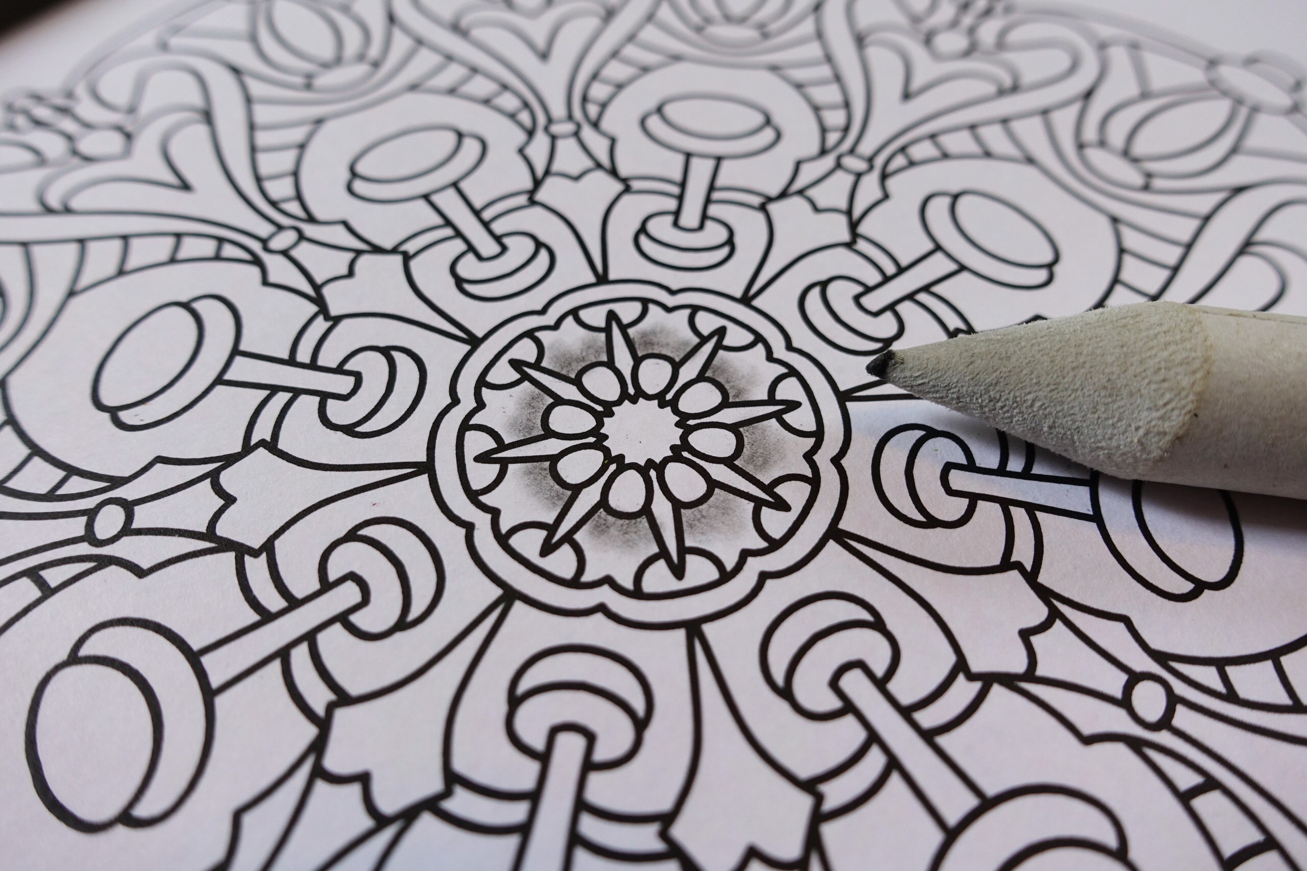
OK – now I’ve smudged my pencil lines to turn them into soft smudgy shadows. You’ll notice that none of the shadow areas are an exact match to their neighbors and that’s fine. Shadows in real life are often somewhat irregular and in an abstract drawing they don’t need to be precise. Their entire purpose is to add the feeling of depth and imprecision gives a beautiful natural quality to the picture.
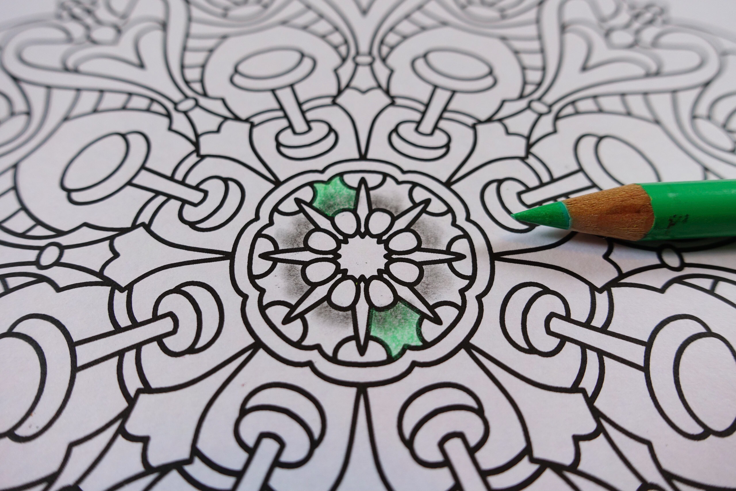
Now I’m going to start coloring over my shadow areas using colored pencil. You don’t really want to do this with markers because the graphite can clog up and discolor your marker tips. I’m using Faber-Castell Polychromos colored pencils today which are probably my most used colored pencils. They are one of those “the more you use them the more you like them” type pencils and one of these days I’ll do a blog post that goes into more detail about all the little reasons that I like this kind of pencil so much.
You’ve probably noticed that I’m not coloring around the circle with this green shade. I often like to color across the circle instead because that way if my hand pressure or the sharpness of the pencil changes as I color – it spreads out the variation it makes it a lot less noticeable.
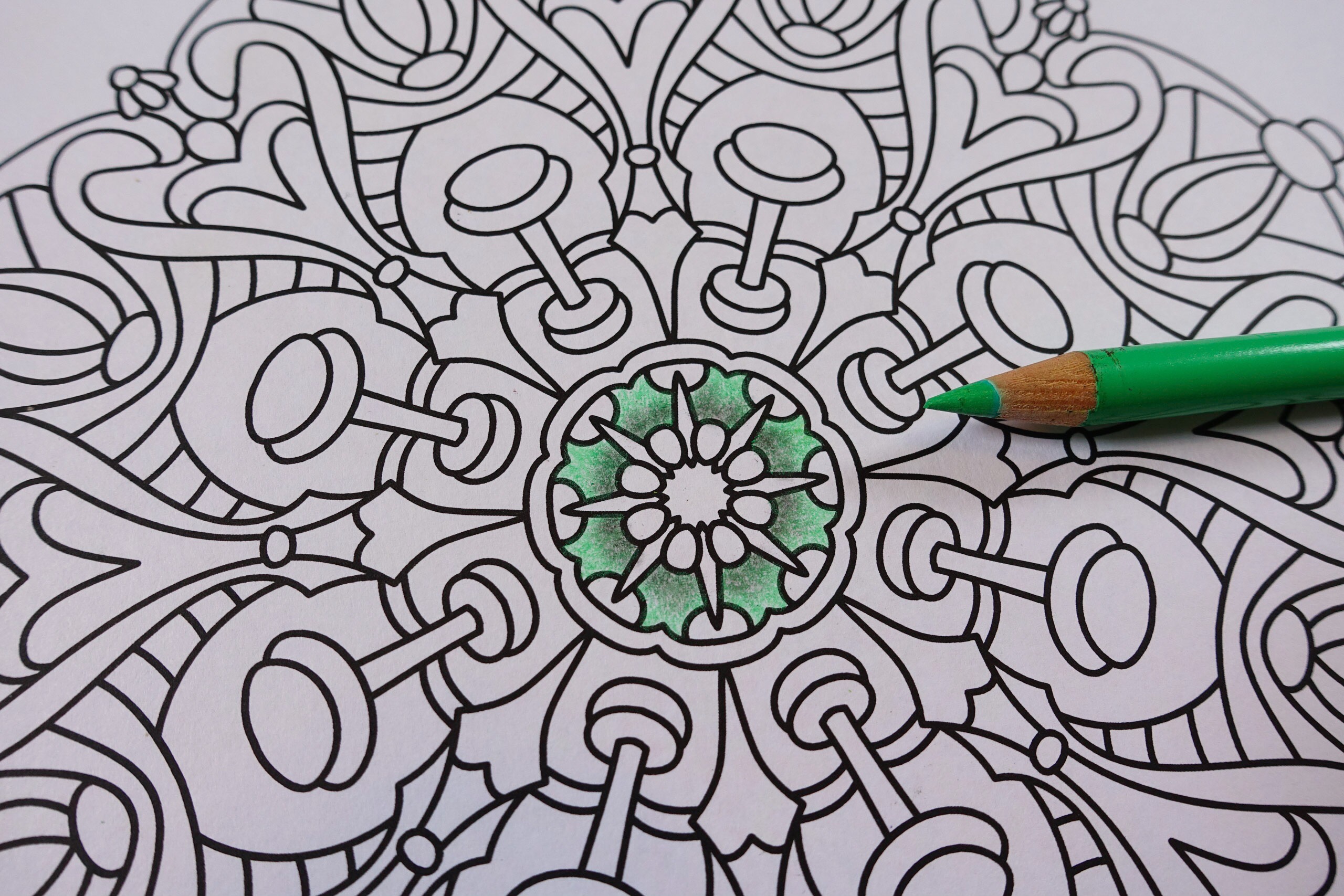
At last the entire ring of shapes is colored in and between the dark parts and the light parts there is the illusion of the shadow. Now at this stage, if you want to be fussy – you can find a lot of different ways to look at what you just colored and think that your shadows don’t look right. I can see that each shadow piece is a little bit different than every other one and I could wonder about whether the dark shadow area is too big or too small for the shape. These are the kinds of things that end up sorting themselves out by the time you finish the picture. When you get to the point were you step back and you look at the completed coloring, none of these little bits of variation will be obvious – but they will contribute to making the entire picture look and feel natural and organic. Getting too precise with your shadows could start to make a picture look weirdly too perfect.
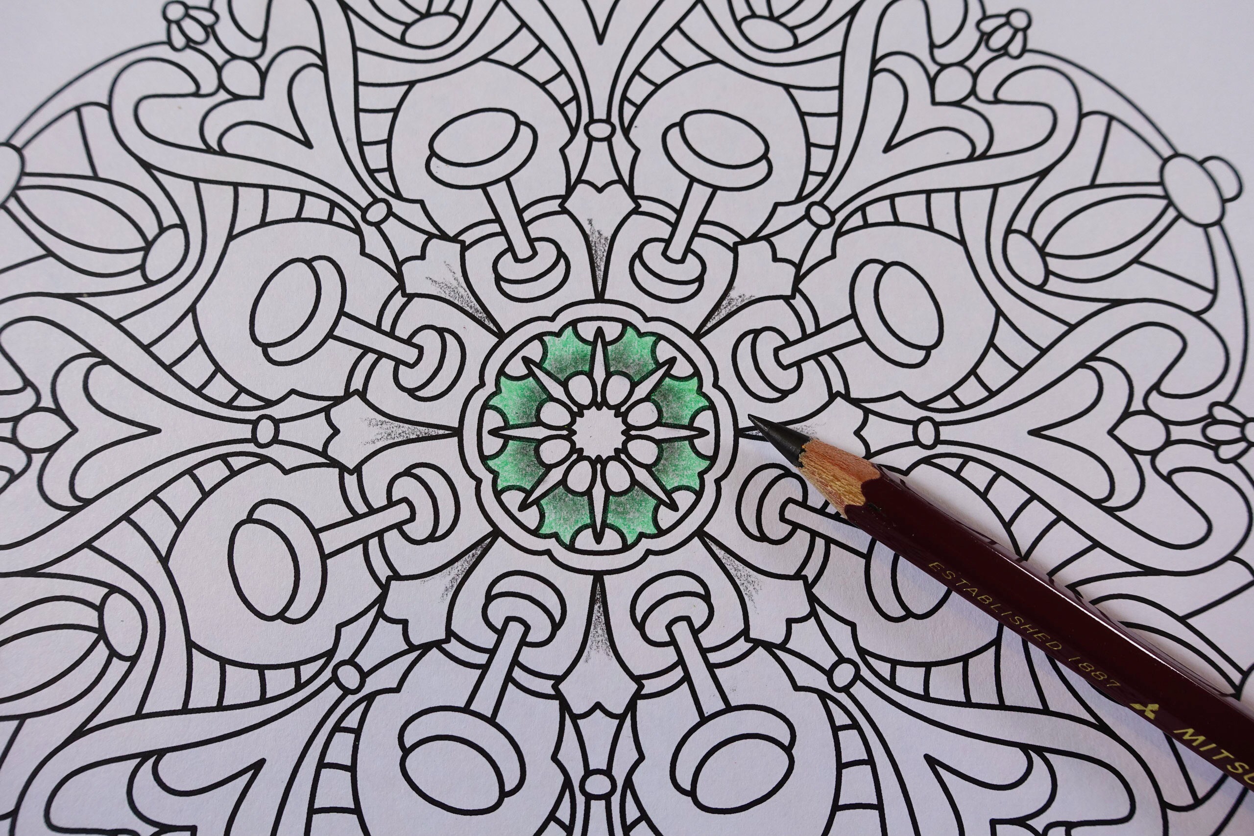
I’m going to color a second set of shapes now and this time my shady spots kind of make those points look like they are underneath their neighbor shapes. This is actually kind of funny because if you look back up the pointy shapes you can see that parts of them look like they might want to be in the foreground and other parts look like they might want to be in the background. My shadow placement is drifting further and further away from reality but all that’s going to end up doing is adding a little more magical and whimsical feeling. If you end up with your shadows going every which way, a round design like this can start to look like one of those pillows that has all those stitched puffed areas on it – and those are always pretty.
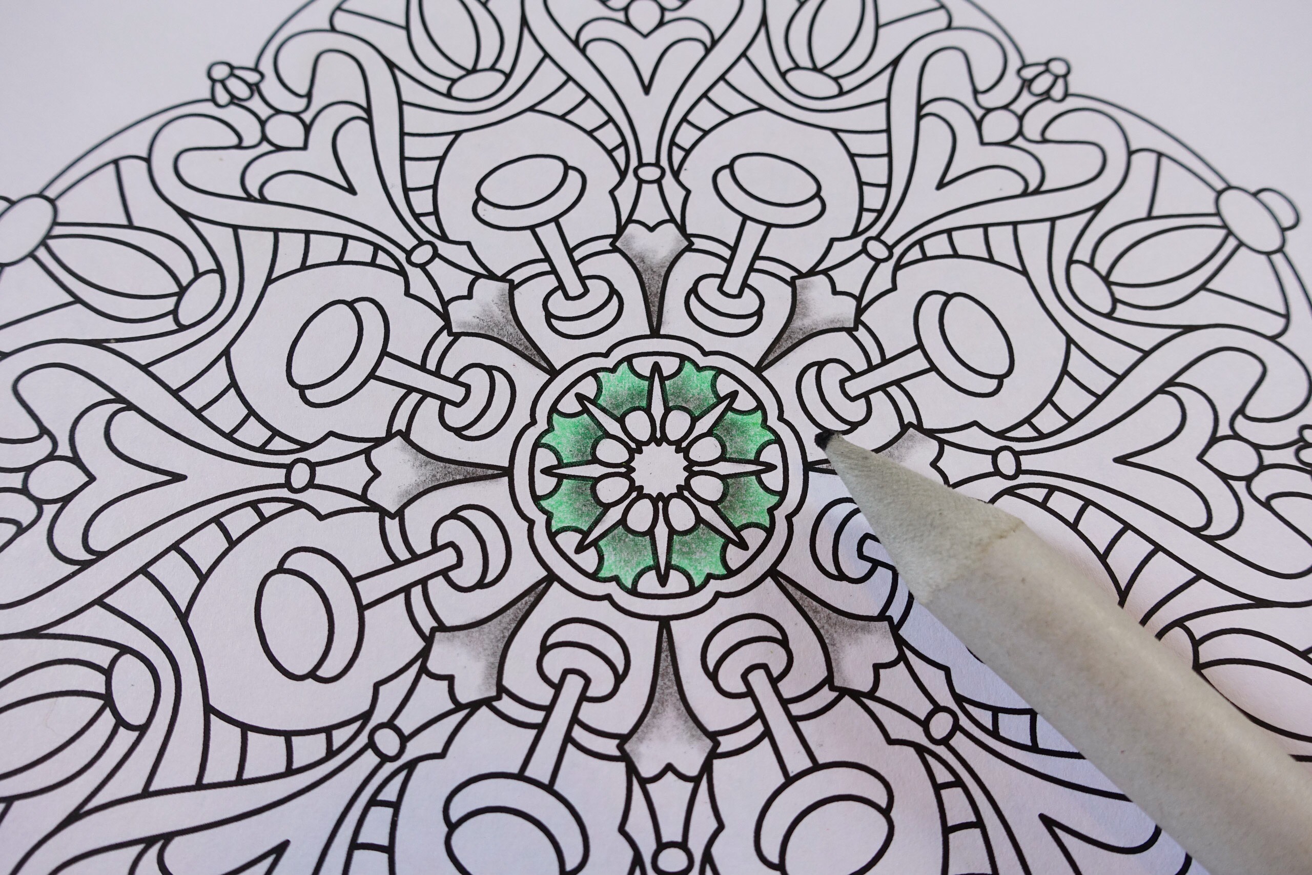
After applying the pencil I smushed my shadows around with my blending stump, and again you can see that no two shadows are exactly the same.

All I need to do now is color over the top of the shadows, this time using a purpleish pencil. I haven’t yet decided if I’m going to stick shadows on every single shape, or just on some of the larger ones, or just put shadows on shapes whenever I happen to feel like it.
(Today’s coloring is from Balance For Crayons And Wide Tipped Markers and I’ll have the finished picture for you in tomorrow’s post.)