
I like to look at sky and cloud colors and sometime take photos to use for color inspiration. Photos like this one:

My camera has a setting that makes everything look a lot like a watercolor painting, and I like that because it smooths out all of the rough reality edges and makes everything extra pretty. Some colorists like to use their inspiration photos like a color picker to select a shade palette for their coloring. I usually use mine as non-literal gentle reminders.
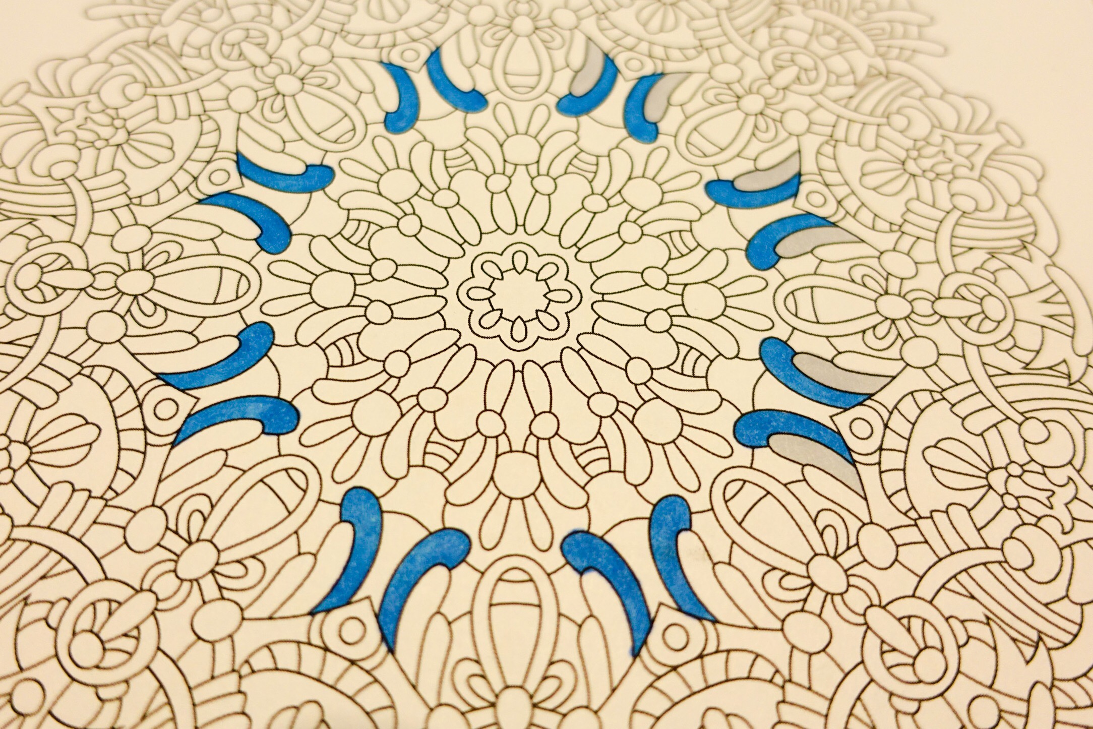
You can see that my blue already doesn’t match any shade in my inspiration picture at all. But the picture has me thinking about that sort of sky, and what it looks like at that time of day. The blue shades in my mind are more intense.
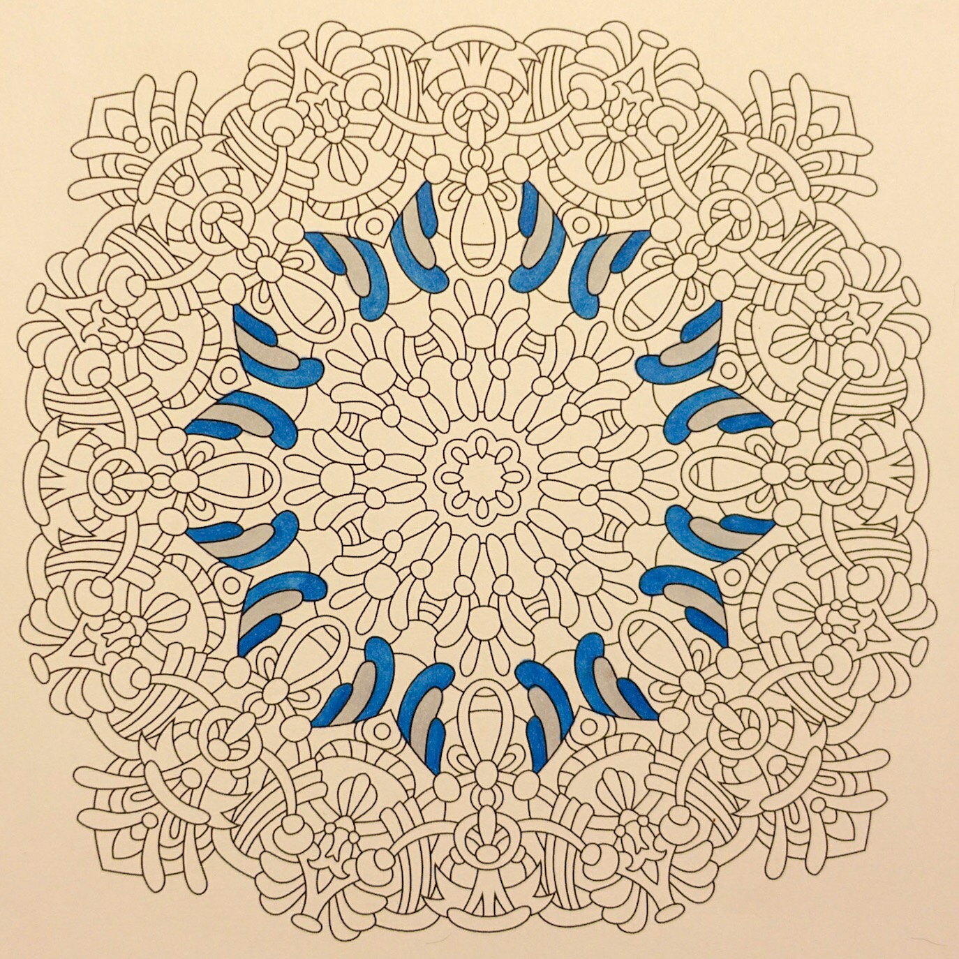
The gray tone is almost silvery at first…
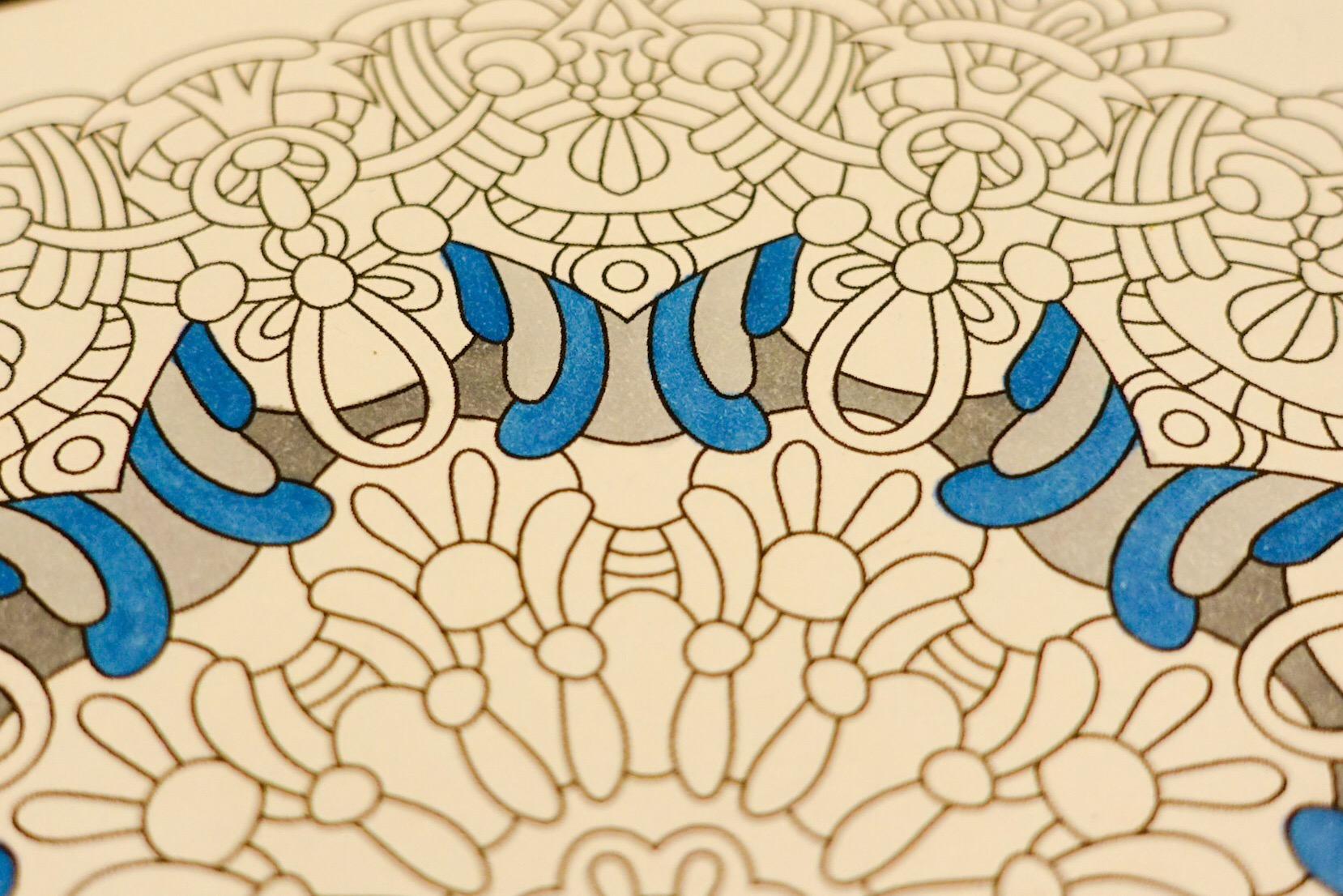
but then my grays get stormier and more ominous.
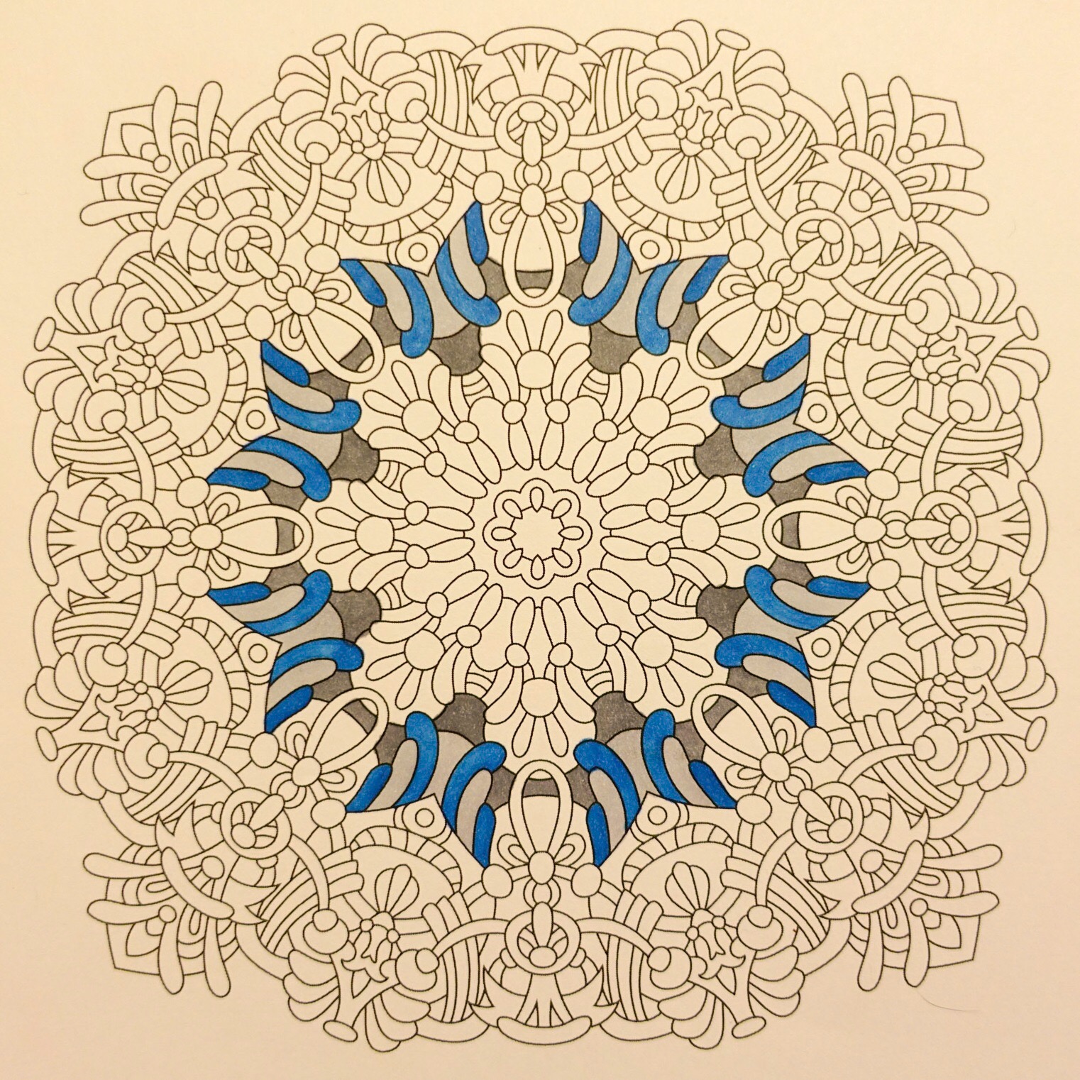
As I get a little further into the design I add a bit more of the stormiest gray.
And then out of the blue comes a somewhat odd shade. At first I thought I just made this one up from my memories of skies. My inspiration photo doesn’t capture all of the times that I’ve seen soft lavender tones, or peach tones, or pale yellowish gray green tones in clouds – but in my mind’s eye those kind of shades appear very often amongst silvery clouds with deep gray bottoms.
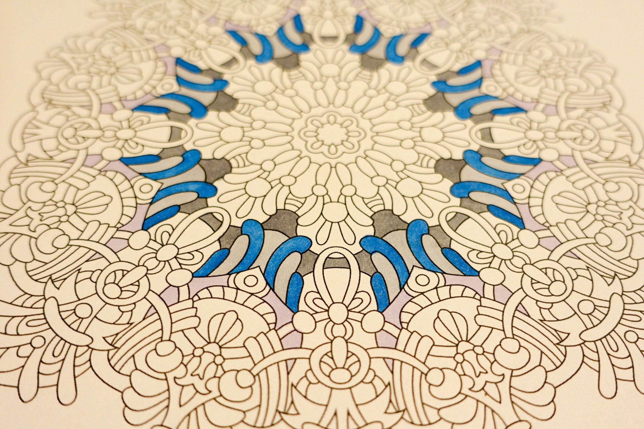
It’s OK to be very free with the way you interpret an inspiration photo – just like it’s fine to use it as a color matching tool. As an adult colorist, you get to make up the rules.
(Today’s picture is from Balance – Angie’s Extreme Stress Menders Volume 1. It’s actually the companion picture to the wide tipped version that I colored yesterday. I think both pictures will tell the story of a summer’s day – but do so very differently.)